Sometimes I kill two birds with one stone…1) complete the looks/template/content for an upcoming event but also 2) bust the brand a bit to see if it will seed something else. This project seems to have nailed the look for some future packaging. What do you think?
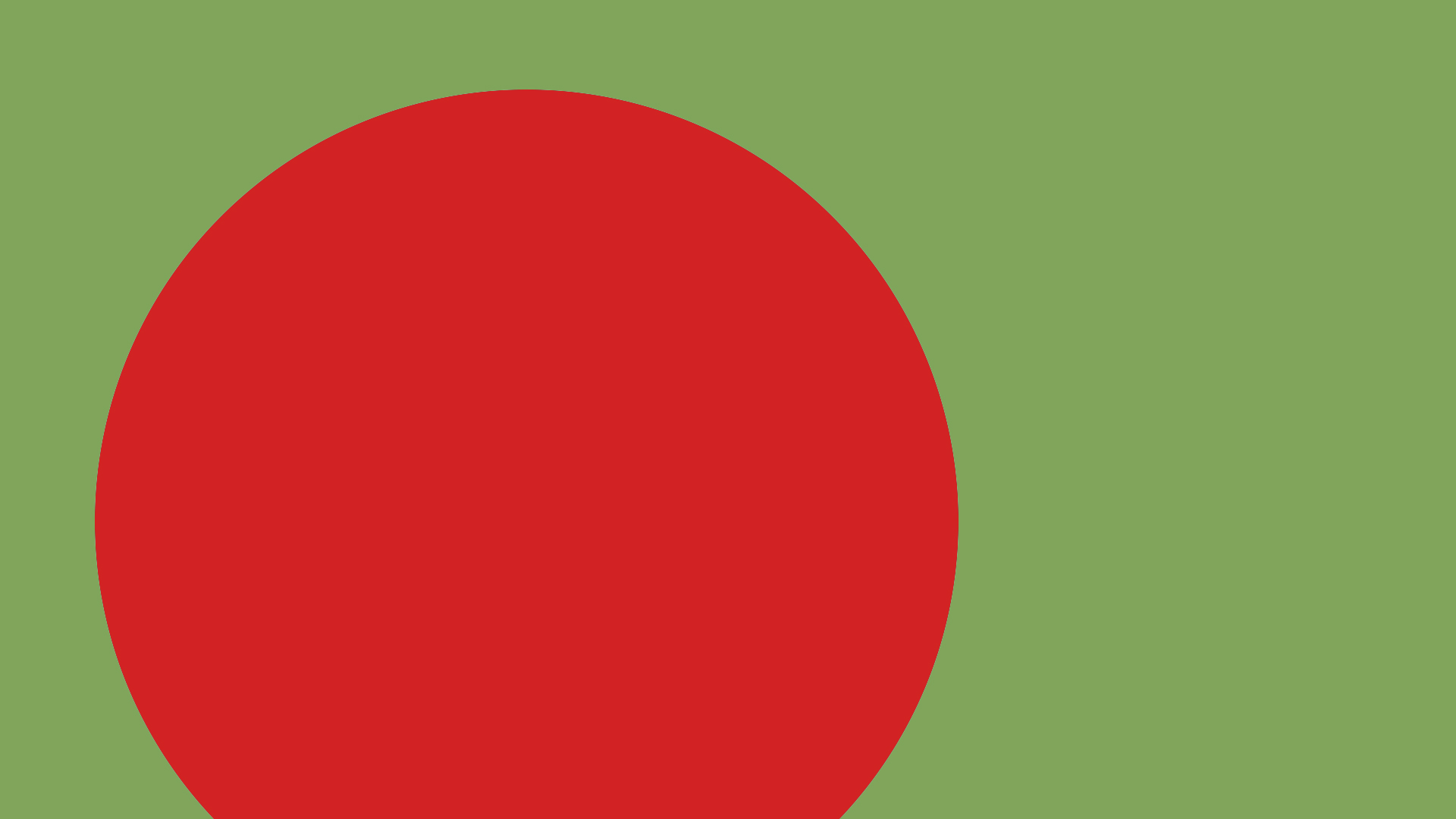
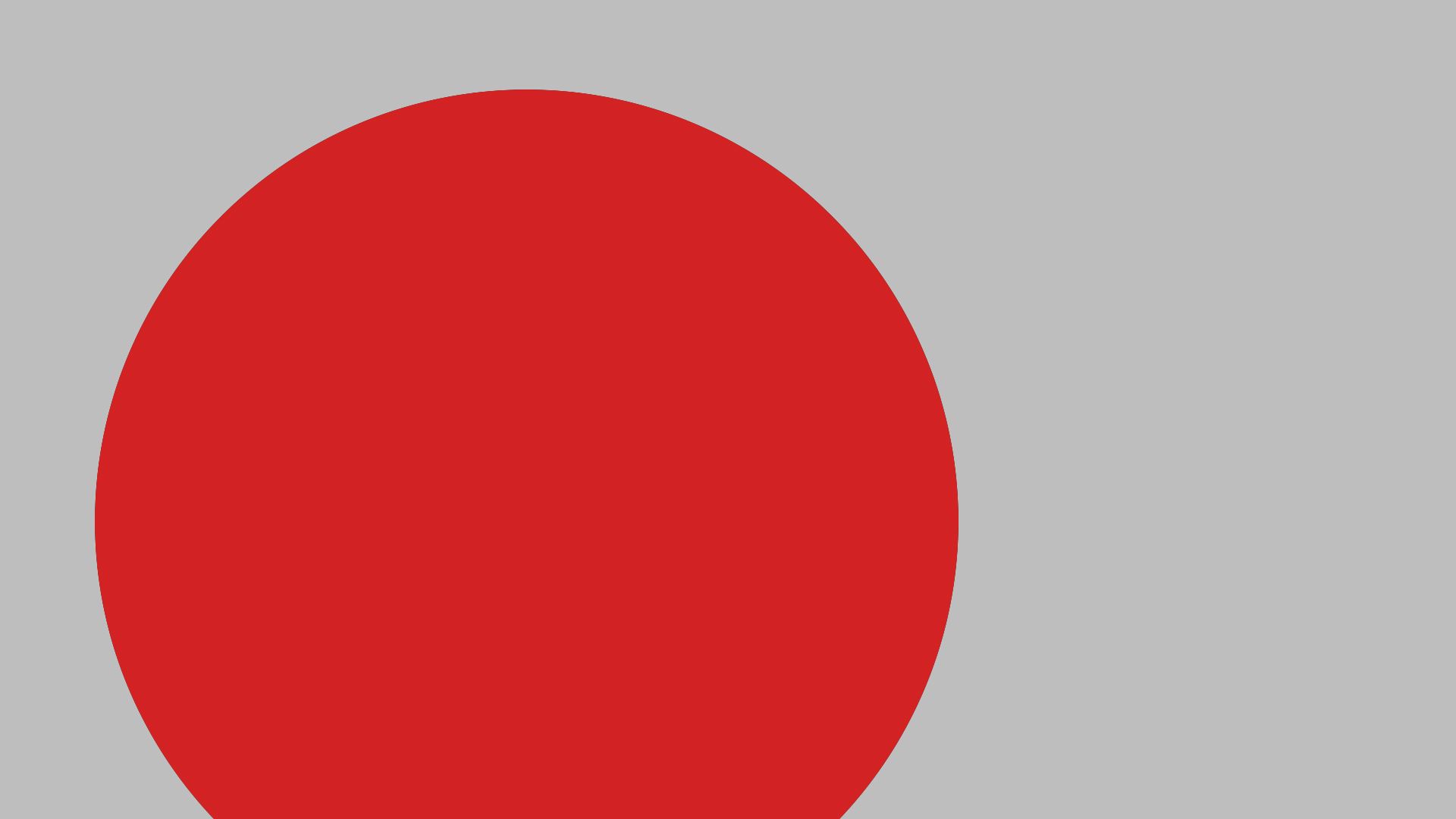
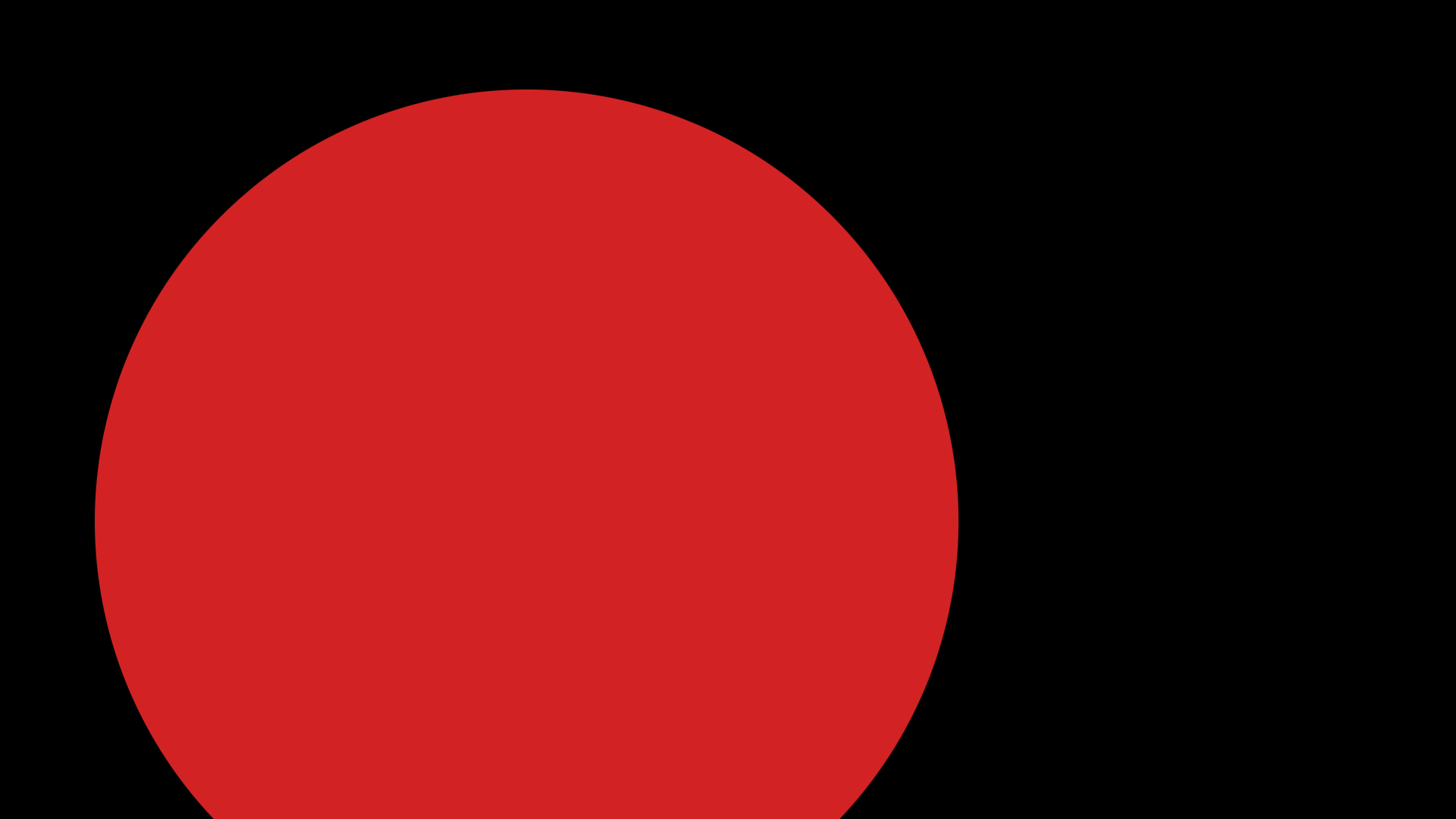
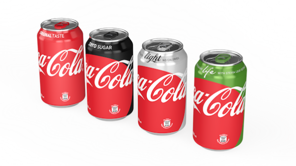
The primary objective was to create a Freestyle machine explainer build-out. First I broke all the brands down into color circles (seen at the footer) instead of the bottle caps they were currently using. Then I broke the rules a bit for section dividers using colors from the main four Coke varieties – Regular, Diet, Zero, and Life. This is also called the “Trinity and the green one.” While this option was a sanctioned exploration, it was a rule breaker according to the brand guidelines (wrong coke red on the red version, red on green, script over a graphic element). Thus it was rejected as the section dividers for this show, but filed away into the pool of future possibilities to be tapped later on for packaging.