
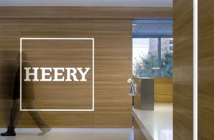
 The creation of Heery International’s identity was the epic saga of a brand defining and then expressing a new attitude. The text in the Heery logo was originally hand drawn with a pencil and ruler in the 1980’s by a forgotten architect. That architect found his inspiration for the Heery font in the cinder blocks of the day and used purple at the request of George Heery the founder. I was tasked with modernizing the logo to line up serifs and equalize the line weights and curves of each letter – this was mainly for the purpose of creating a precision logo file so the wood cutter could make the signage in the picture.
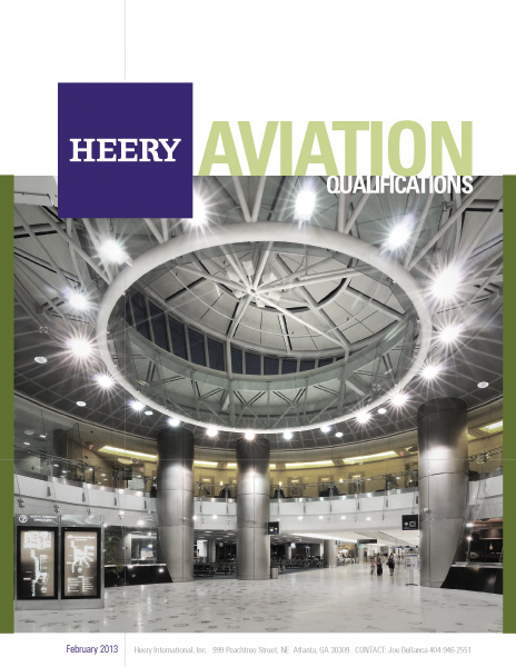
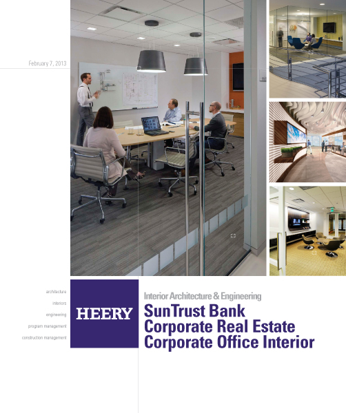
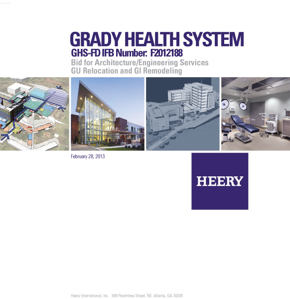
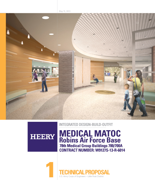
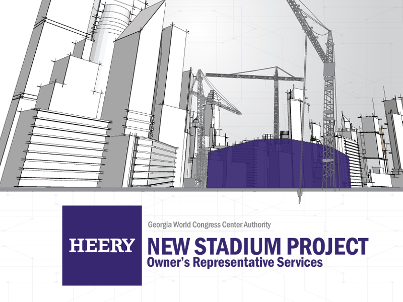
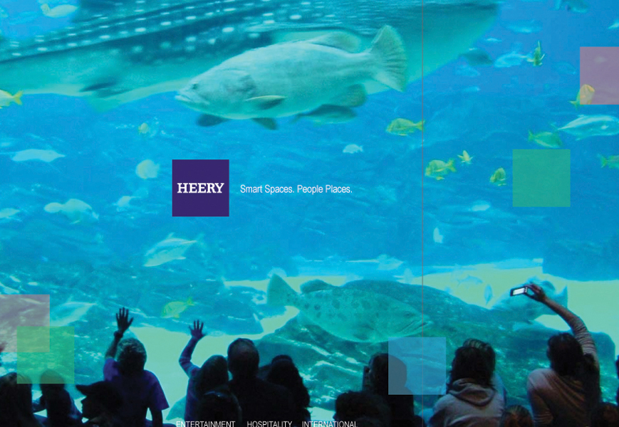
For the purpose of refining their brand, I wanted to transform the logo into a stamp of ownership that could be universally used on proposal and blueprint alike. This tweak was needed due to the text logo often becoming invisible in composition because it was indecipherable from the other text on any page. My solution was to place the logo into the purple square and reverse out the text logo to white. I found that once I dropped that square onto the page, it felt as if it grabbed ownership of everything under it. It also seemed to have a more youthful modern feel than the organic text from the past. The highly contrasting white text logo on top of purple commands attention and is always clean and visible. This all-bases-covered symbol portrays who Heery is today while also paying homage to where they came from. The new identity caught on quickly and the rest of the print collateral fell into place like Tetris. Now when the Heery square logo is placed on a project picture or a design document, it acts as a seal of approval.