These graphics were the result of my test to get in the door at Coke long ago. They gave me a five page word document and asked me to give it a go on the house. I told them I will do it, but, if they thought it looked pro, they would pay for my time. On my way home from that meeting I was wondering what the hell I was thinking. I am glad I stood my ground.
The test on this project was to see if I could stay within the bounds of the brand but still come up with well designed content. I upped the work order with a theme look, some nice builds and graphic/animation explorations. When I sent this back to them, they asked for the invoice. I became their lead presentation specialist and graphics consultant. Later they gave me a nickname – The Agency Killer – because I kicked the big shops from long standing projects by taking the work in-house.
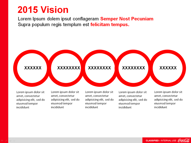
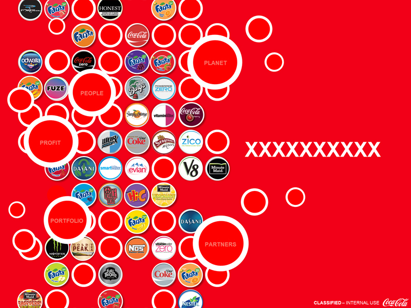
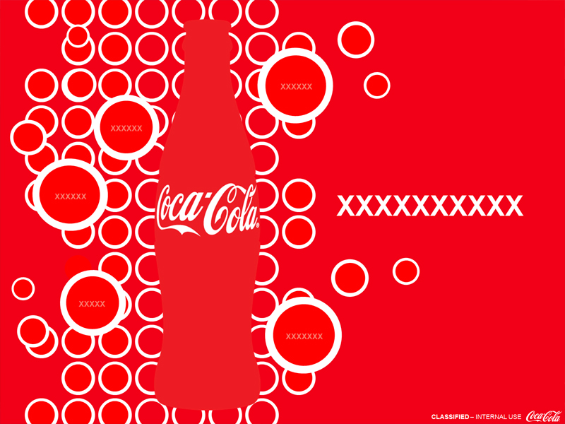
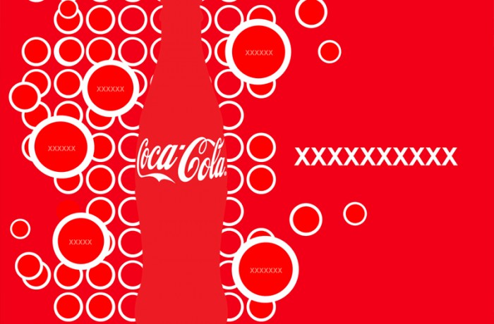
I found out later that subtracting shapes to create negative space objects was decided to be a print no-no, but later it became a useful technique when building animations. Every project I do with Coke has three options. One exactly as asked, a second more minimal variation, and a third one that stretches the bounds of the brand. Any option not used for the current project drops into the possibility pool for future projects. My rogue designs have been sampled to derive ideas for high-profile campaigns and the brand itself.