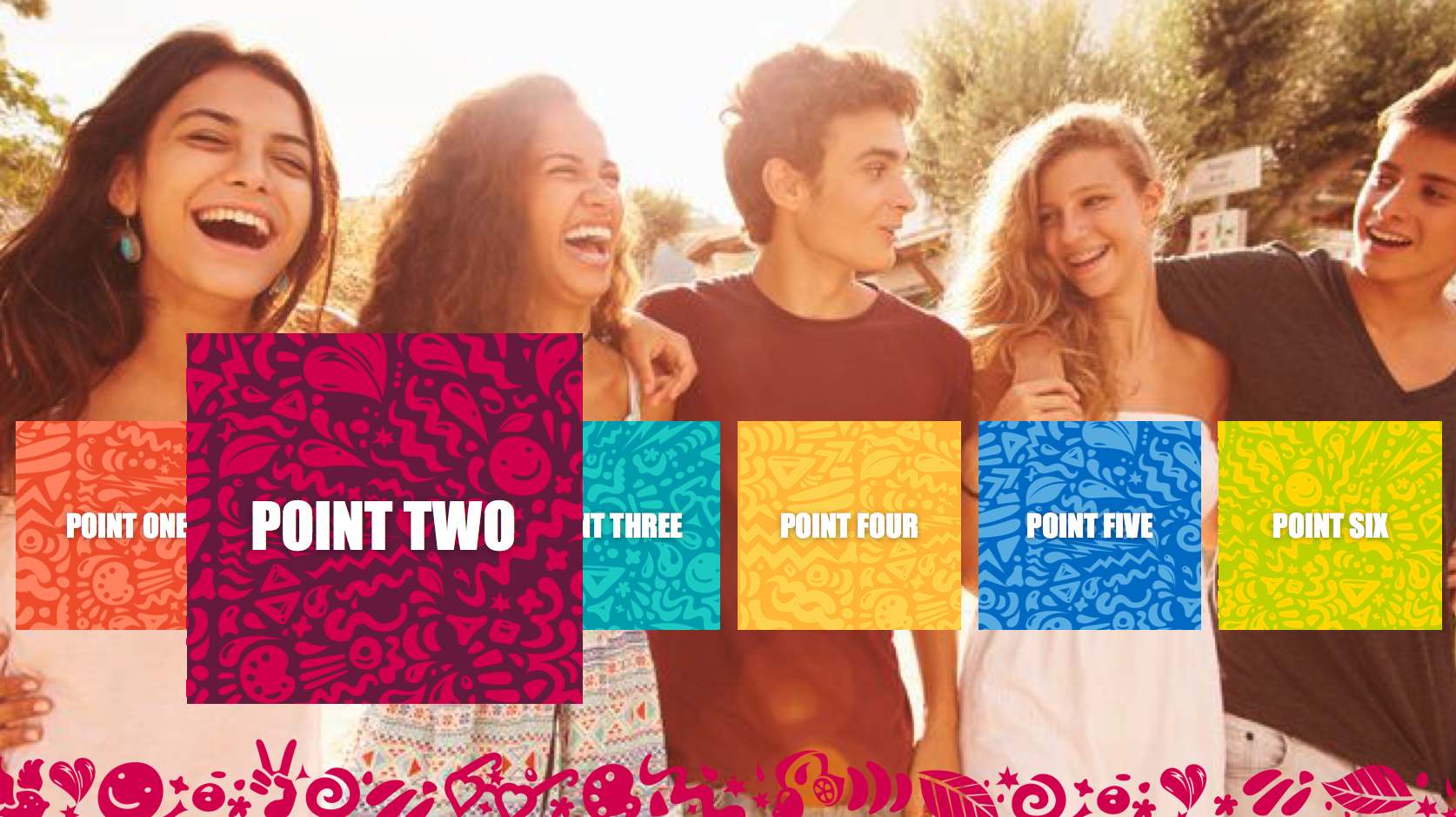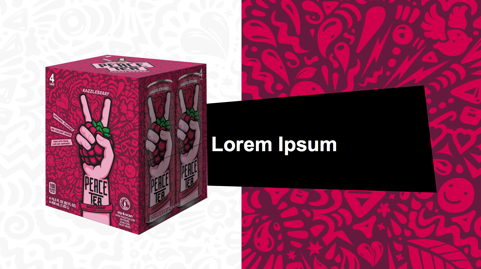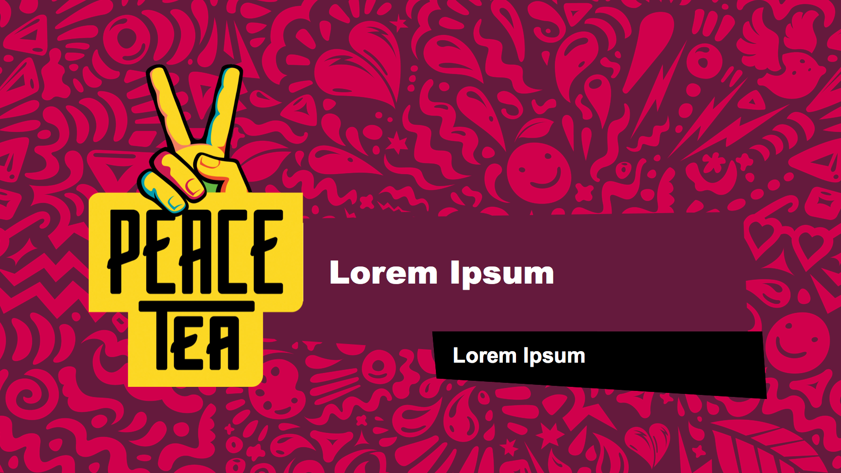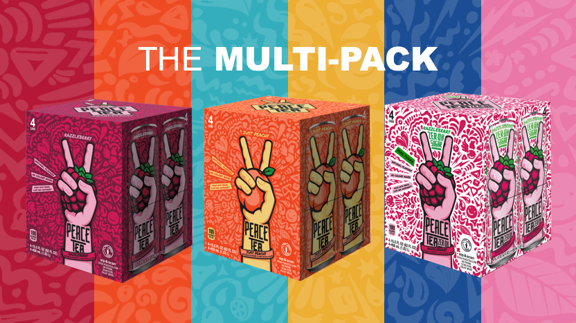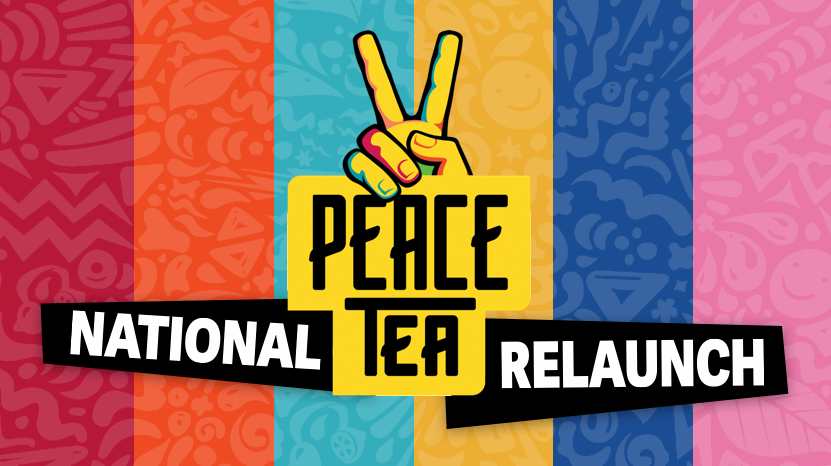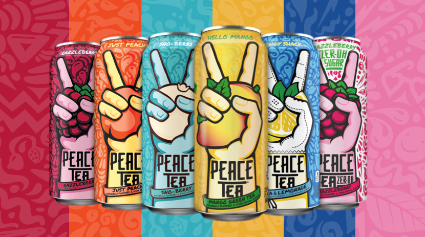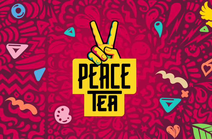
Brand relaunch needed a look that mirrored the can art but that also provided a flashy fun look required to cater to the younger audience. We iterated until we found the looks that feel like they were always there but have never been used before… another part of the family. Shapes, black bands, slivers of can backgrounds, happy people and bold text made this one an exciting one to behold. Each speaker was a different color and any flavor product worked on any color because being all over the place with color on this one was aok. The tiny icons being highlighted by different colors and then animating that highlight was the final piece that pulled it all together.